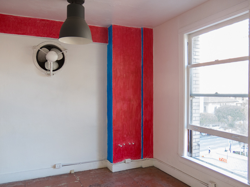
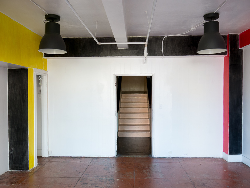
The Furnished Room
Put too much in your place,
you only shrink the space.
Pictures, furniture in excess
can make a room a dreadful mess.
Wardrobe, bed, chair, and couch
deprave its trimness with debauch.
Several other things as well
in the room are laughable.
Conches, figurines, and vases
have woozy, wheezy, whispering voices.
Pillows, blankets, shaggy mats,
ill-assorted, do not match
the notion of a now and here.
Vanished knickknacks bare
teeth too sensitive, gnaw away
the fabric special to each day.
A room is brighter and more spacious,
cleverer and more bodacious,
if you forbear to place
over its primal face –
by stuffing every crack with ornament –
another that’s more lush, more opulent.
The room itself will then bestow
upon the room a quality, a glow.
Too much knowledge, multitudes of skill
some folks would jettison, they might as well.
One would be more
without humungous stuff inside one’s door.
Not letting go ages and freezes you,
perpetual retention causes wrinkles too.
A room was never meant to bode the worst,
so let it stay the way you saw it first. (1)
Polychrome functioned as a means of highlighting particularly important regions of a building facade by contrasting a multi-colored field to the solid white or red of the facade proper. Since we now know that polychrome treatment of architectural sculpture developed during the Late Preclassic period and was later transferred to lintels, stelae, and other formats, it is evident that the use of color evolved within the context of public rather than semi-private or private usage. Both the Late Preclassic and Early Classic masked facades were great public stage fronts displaying the cosmogram within which ritual and dynastic activity occurred. Polychrome treatment of these exterior surfaces expanded the distance from which information could be read. The extension of this distance may well explain why the Late Preclassic use of line with flat color was abandoned in favor of the exclusive use of solid, flat color in large-shaping zones. Line requires a close proximity to be read, while large areas of solid and highly contrasting color make information readable from longer distances. (2)
(1) Robert Walser, Thirty Poems: Robert Walser, trans. Christopher Middleton (New York: New Directions, 2012), 30–31.
Written 1928-1929. Originally published in Prager Presse, June 1932.
(2) Linda Schele, “Color on Classic Architecture and Monumental Sculpture of the Southern Maya Lowlands,” in Painted Architecture and Polychrome Monumental Sculpture in Mesoamerica, ed. Elizabeth Hill Boone (Washington D.C.: Dumbarton Oaks, 1985), 37–38.